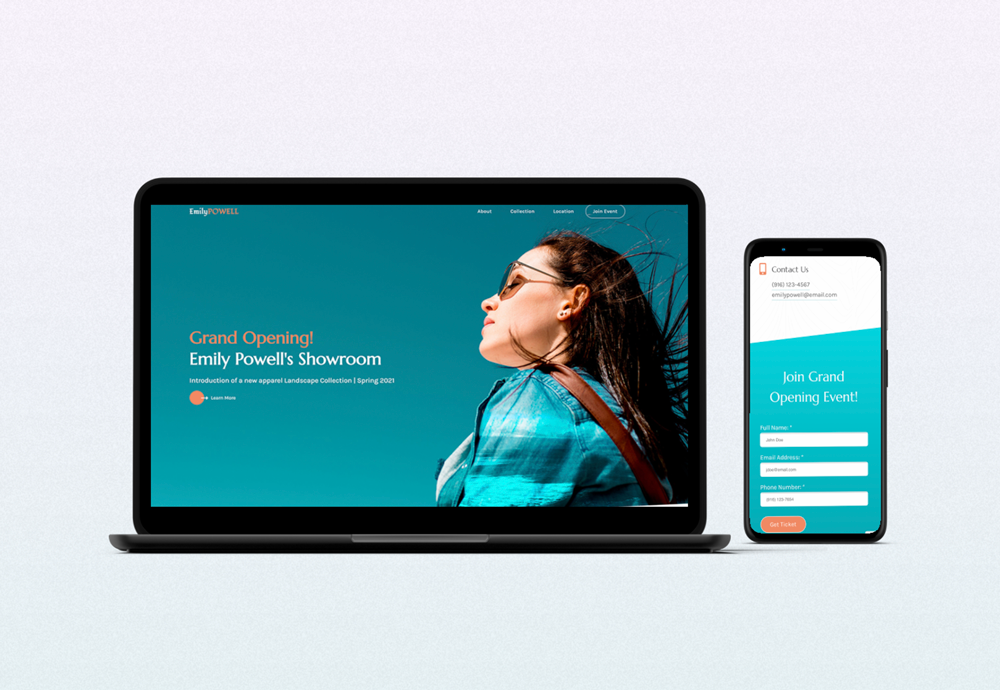
Emily Powell’s Showroom

responsive microsite

Overview

This is a design concept of a showroom. I came up with Emily Powell’s Showroom and built a fully responsive microsite for it.

Role: UI/UX designer, web developer.

Software: Adobe Photoshop, Adobe XD, Visual Studio Code.

Link to the website: click here.

Design process

Planning

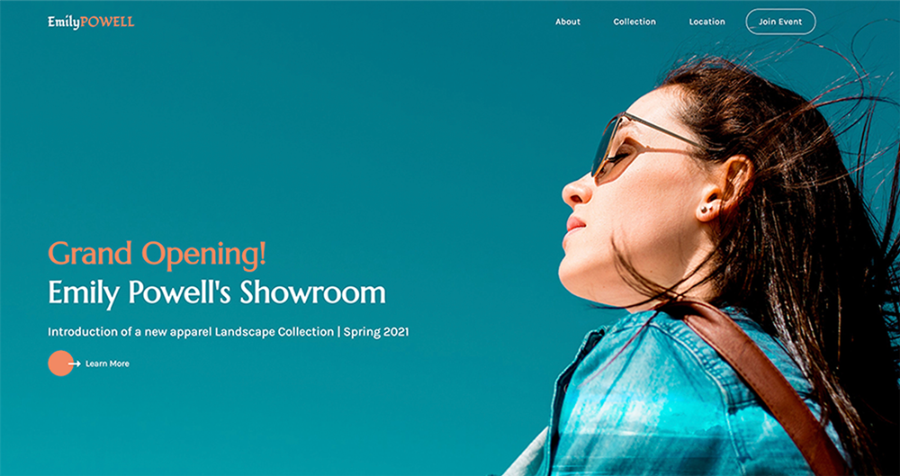
The concept for this project was created back when I was taking a web design class. The goal for the project was to design and develop a microsite for a company of a major influencer on social media. 

Since I’m passionate about traveling and landscape photography, I decided that a major influencer would be a travel photographer who decided to start her own line of clothing. A random name generator helped me to come up with a name – Emily Powell.

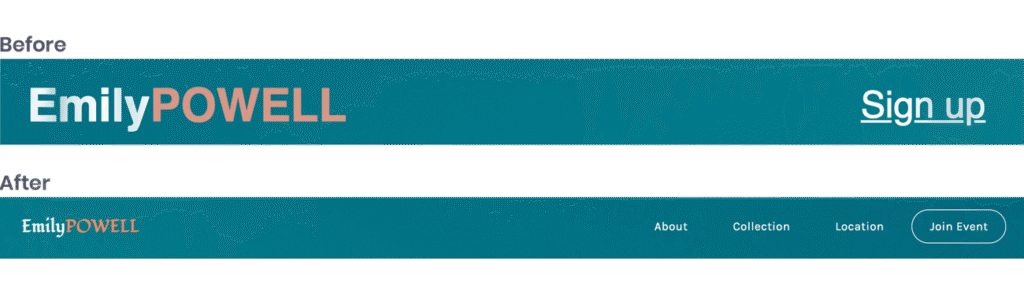
While the concept seemed fine, the microsite needed some updates. You can take a look how the design looked before here.

So I decided to refresh it, focusing on implementing what I’ve learned since then

Collecting the Content

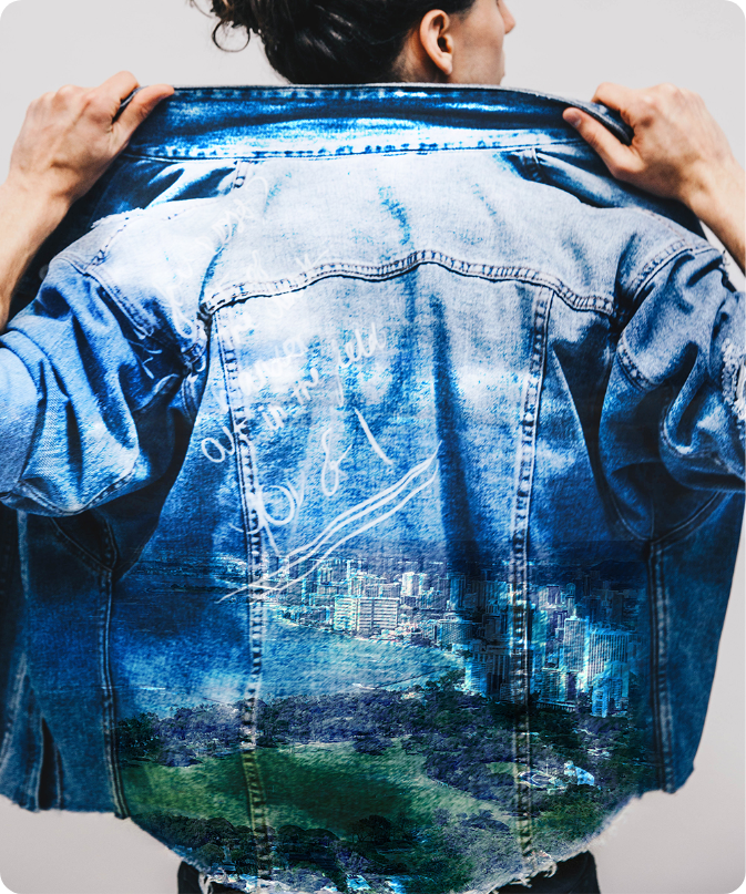
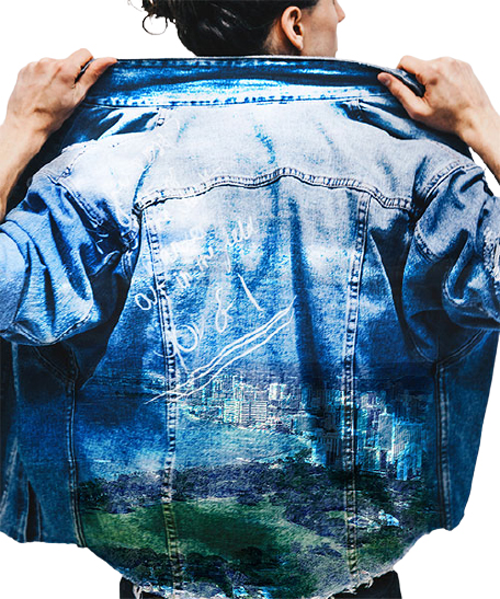
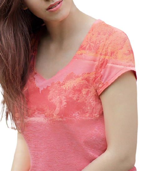
Since this project already existed, I needed some modifications to the content and images.

Speaking of the images, I modified the sourced ones by adding my own photographs as an additional layer in Photoshop:

But with the redesign I removed the background, so they look cleaner and more consistent.

Once I was done with images and content, I started the redesign.

Design

I started the redesign by choosing a different typography. I was looking for an elegant font that would also emphasize my concept, and I found Marcellus. It was perfect for the headings, but for the body copy I picked a more readable one Karla.

As for colors, I slightly changed them to increase contrast. And I also added a texture in the background of the main section to create a visual interest. 

Once I came up with the right fonts and color scheme, I started the redesign with the header

Navigation didn’t have many options, which might affect user experience not in a good way. The solution was to provide a navigation to each section on the page.

I flipped the header image horizontally, because I wanted the title to be first read by users. To balance out the image, I added a color to the title and button. Additionally, call to action was not in the right place in terms of proximity, so I moved it closer to the header content:

Two calls to action on the bottom of the page, I changed to a single form to get a ticket since a signup form was already in the footer. And in the footer I wanted to add more useful information.

After that, I move on to the next step, development.

Development

Even though I coded this page before, I wanted to start from scratch to get a cleaner code and practice HTML, CSS, JavaScript and SASS. And for making it responsive, I used a mobile-first approach in development. Take a look at the final result here

You may also like:

CoffeeLounge

responsive landing page

Disaster Relief

award-winning mobile app prototype

The Studio Coworking

custom built WordPress theme