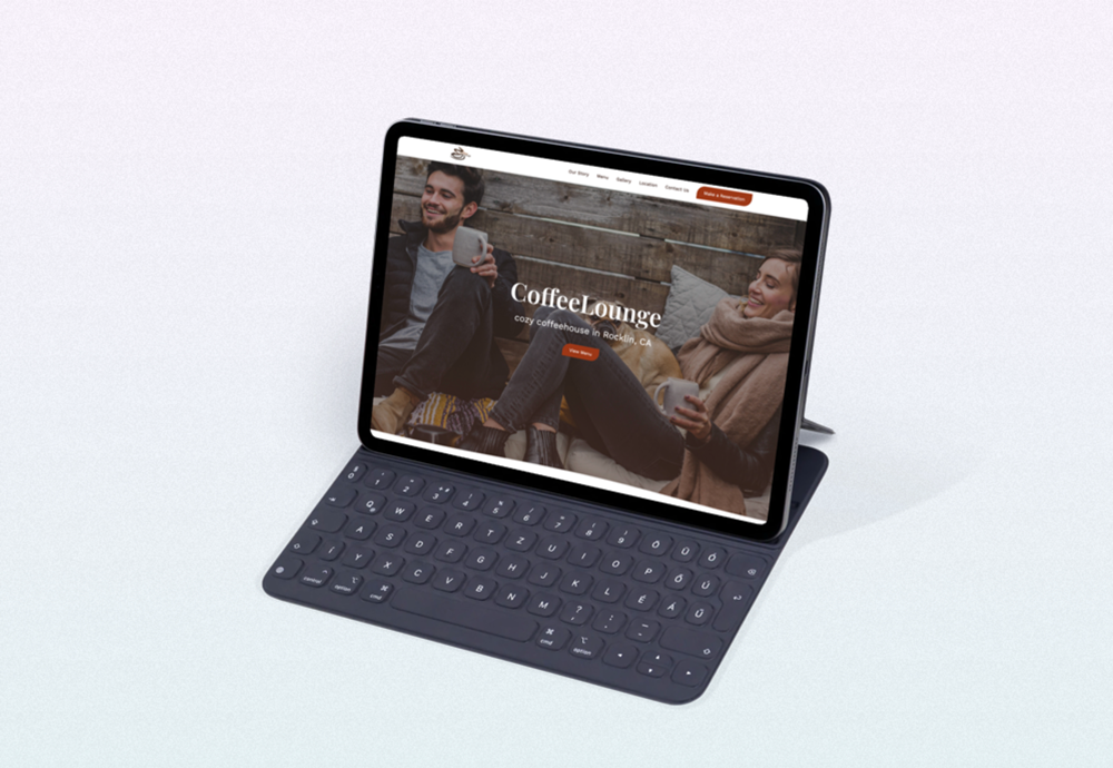
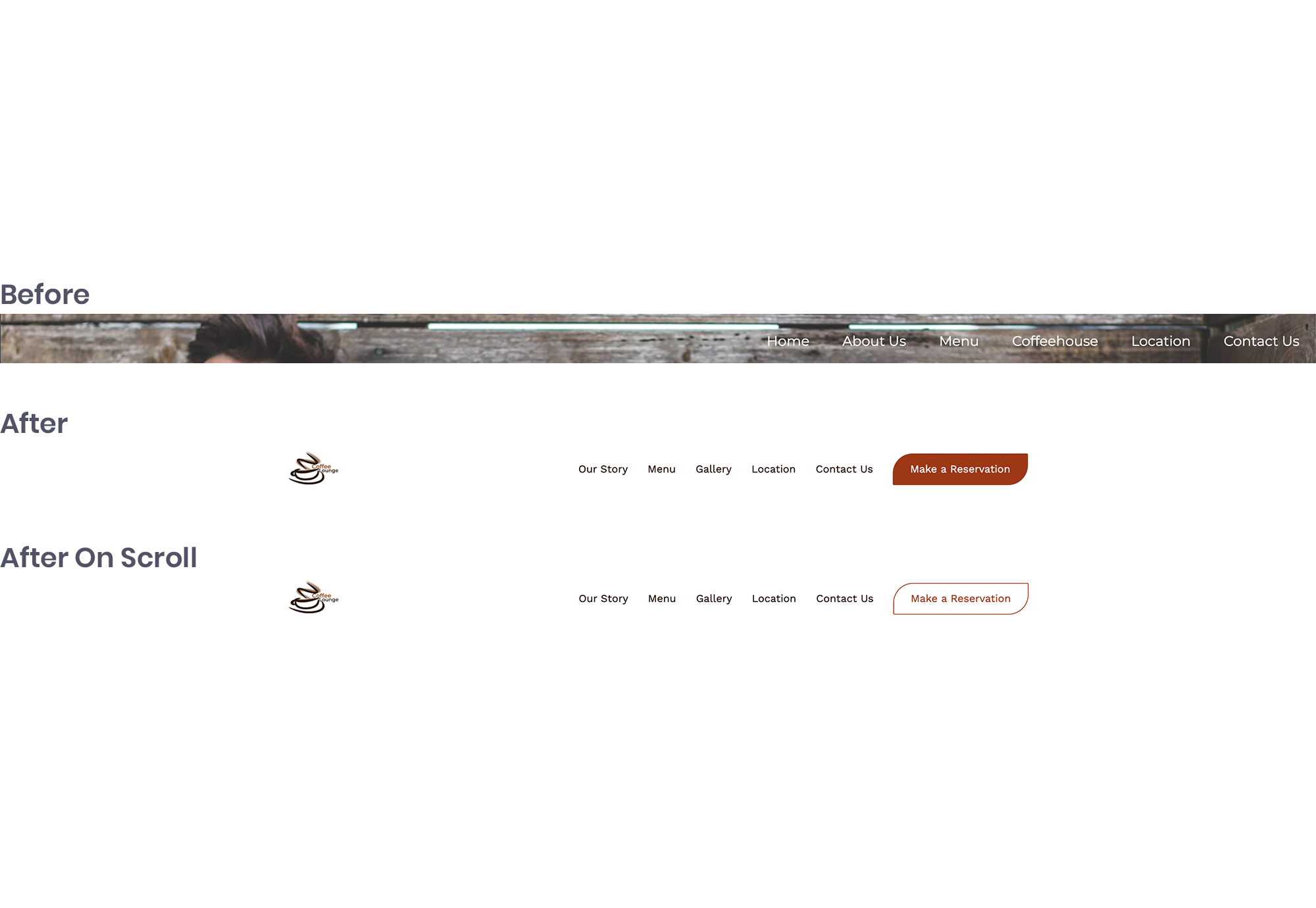
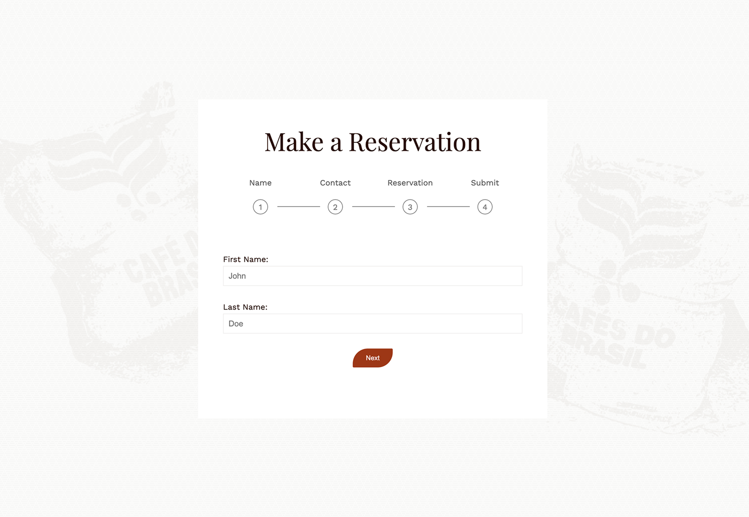
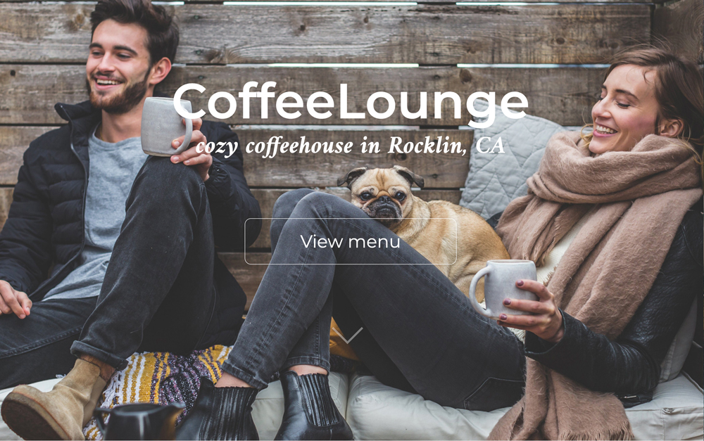
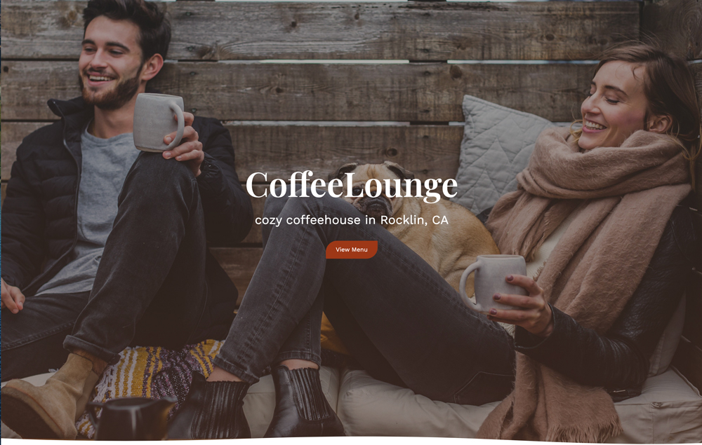
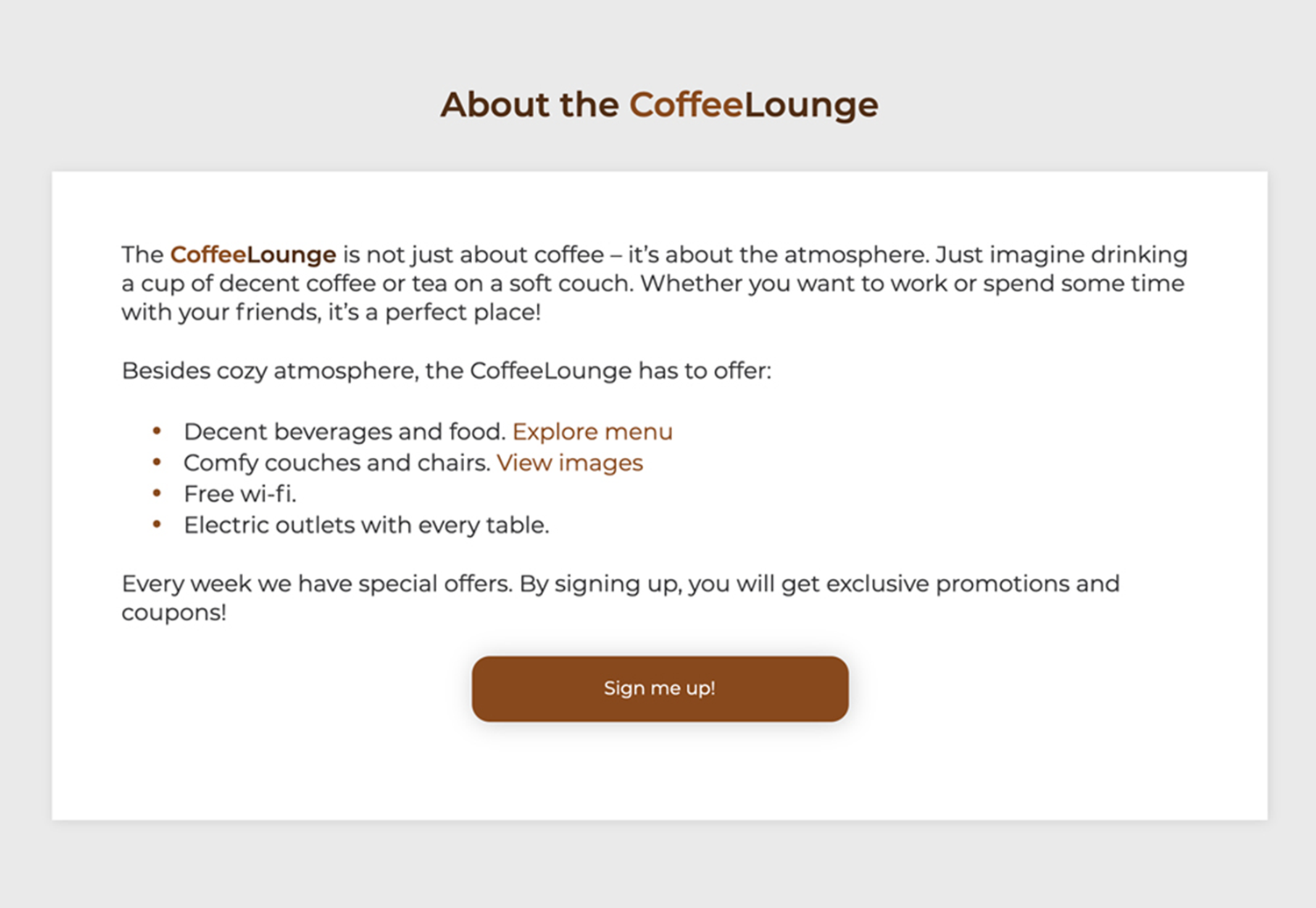
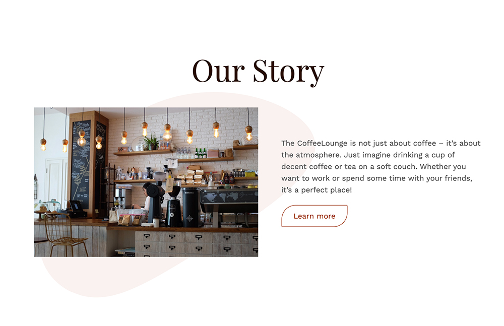
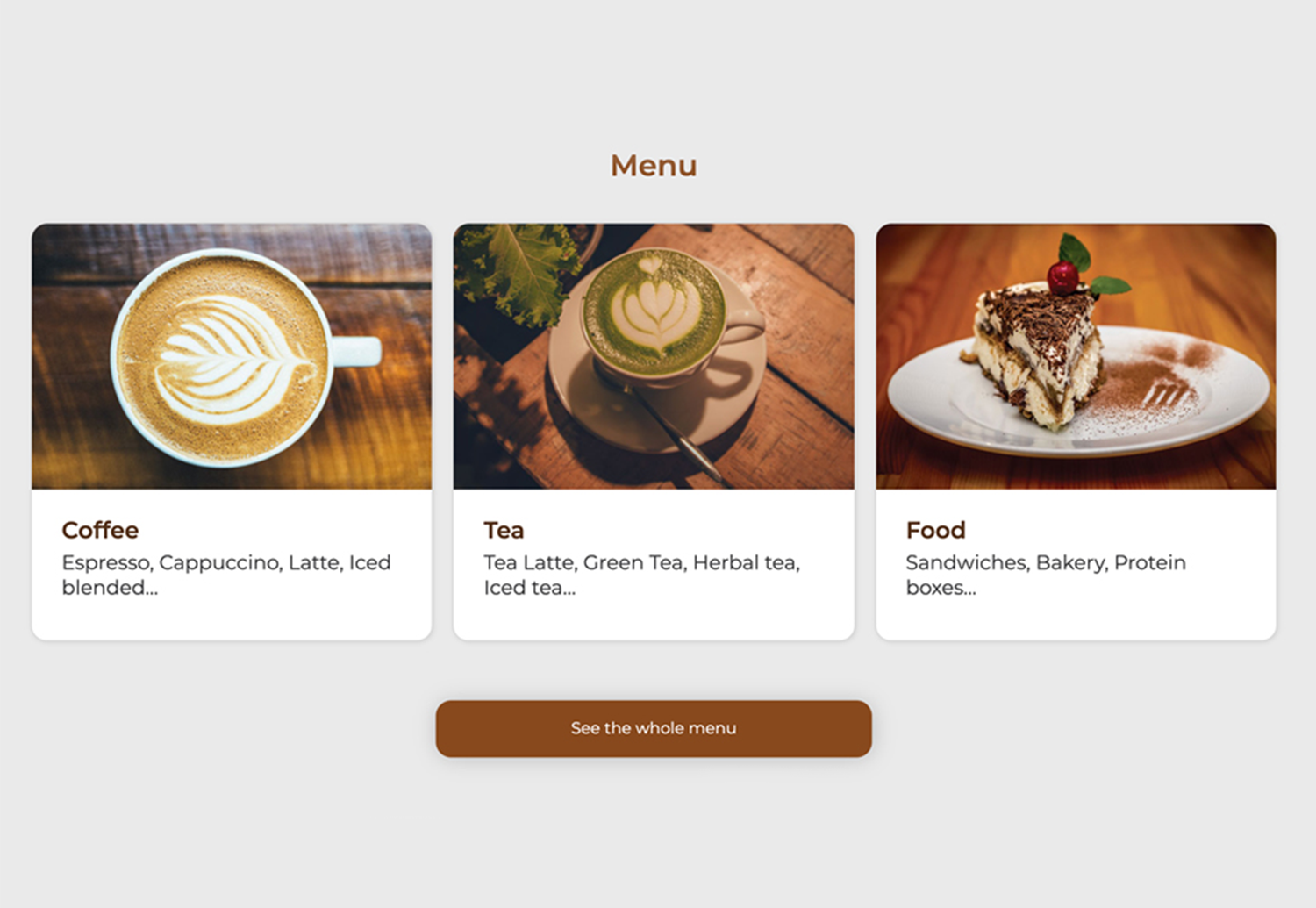
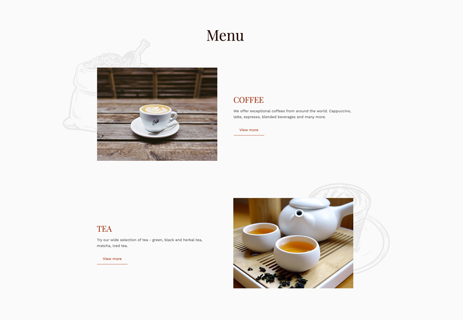
CoffeeLounge
responsive landing page
Overview
This is a design concept for a coffee house. I came up with the CoffeeLounge, a cozy coffee shop, and built a fully responsive landing page for it.
Role: UI/UX designer, web developer.
Software: Adobe XD, Adobe Photoshop, Visual Studio Code.
Link to the website: click here.
Design process
Planning
The concept for this project was created back when I was in school. The task was to pick any topic and design and build a responsive webpage.
While looking for inspiration, I found a beautiful photograph (see below), and the idea to create a coffee house came to me right away:
With constant learning and keeping up with skills in design and development, I decided to refresh the CoffeeLounge landing page and provide a better solution to this. But before I dive in to redesign process, you can take a look how the design looked before here.
My goal for the project was to refresh this website focusing on accessibility and implementing some new developing techniques I’ve learned.
Collecting the Content
Next step was collecting the content – body copy and images.
For the body copy, I liked the story the landing page was telling users, but I wanted to add more sections, like testimonials and making reservations. I also removed the Contact Us block since all this information was already in the footer.
And I decided to keep most of the images, however I wanted to add some vector graphics as background to the images (I’ll show the solution in a design block below).
Design
I started the redesign with a navigation bar – I added a white background for better readability and changed the bar height and a primary button color on scroll:
To make the header content more readable, I added a dark gradient overlay to a background image. I also moved a button closer to a title to group them, so it creates a seamless relationship between the elements (gestalt principle of proximity).
As for typography, I decided to create a different, more elegant look by using two different fonts. And for the color scheme, I picked an earthy one since it’s ideal for a relaxed and welcoming environment. Moreover, I checked if the colors I picked had a good contrast ratio and passed web content accessibility guidelines.
Now, let’s take a look at the sections – almost all of them were in the boxes. I don’t mind them, but there were way too many. I found a better solution of removing them plus adding some round shapes (a blob and vector graphics) to create more visual interest:
The element I wanted to add was a form for making a reservation. The challenge was that the form was too long. It’s not that there is a limited space on the page, but it seemed intimidating and daunting. To create a positive user experience, I decided to break this form into multiple pieces/steps:
Now let’s move on to the next step, development.
Development
Even though I’ve coded this page before, I started from scratch. And there are a few reasons for that – I wanted to practice writing a DRY (don’t repeat yourself) code and I wanted to do that with SASS. There were a lot of challenges for me in this phase, but I do like challenges because I learn a lot. Take a look at the final result here.
You may also like:

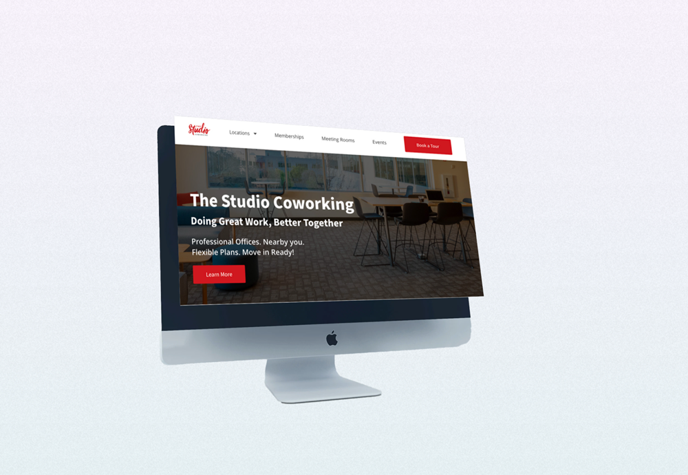
The Studio Coworking
custom built WordPress theme
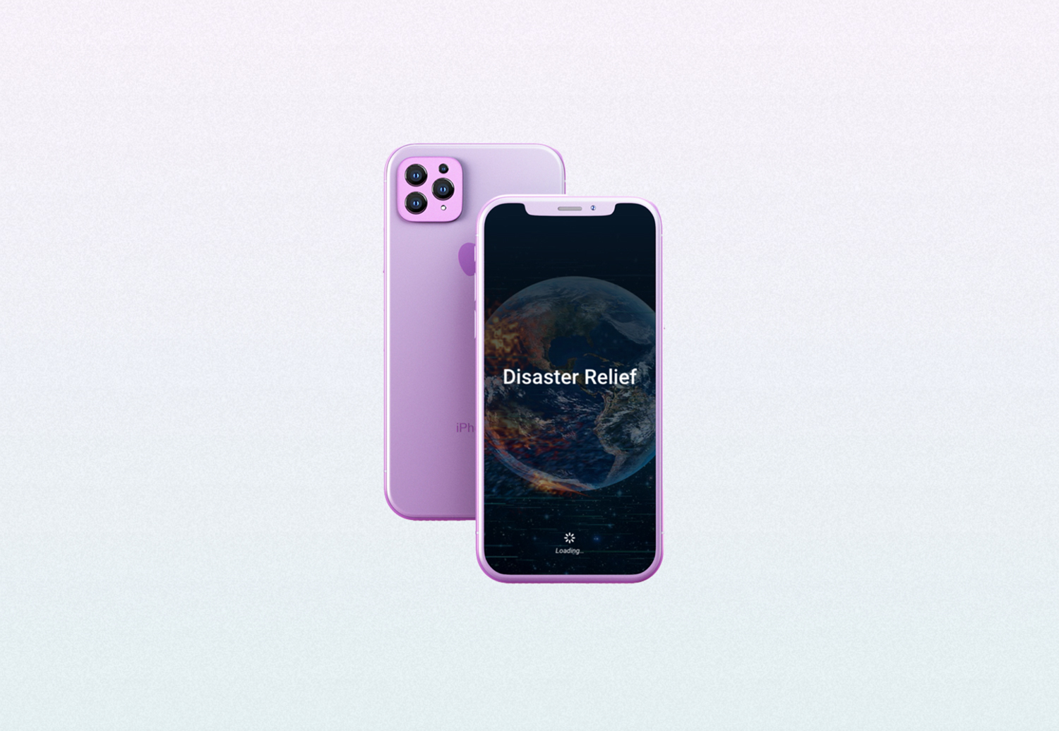
Disaster Relief
award-winning mobile app prototype

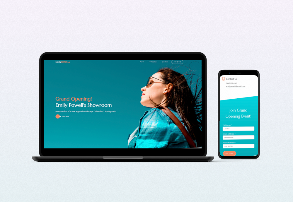
Emily Powell's Showroom
responsive microsite


