Disaster Relief

award winning mobile app prototype

Overview

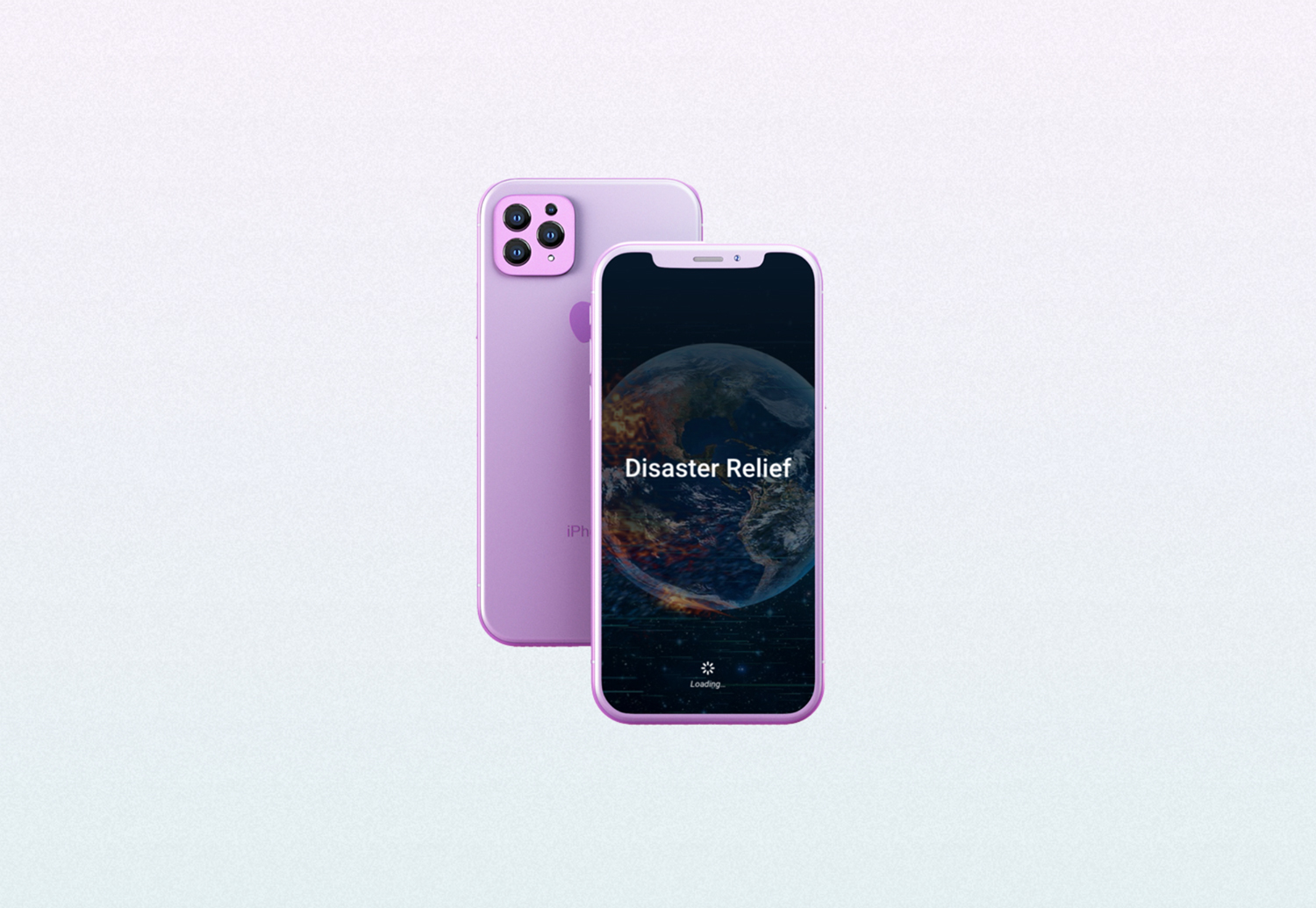
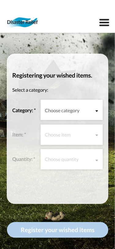
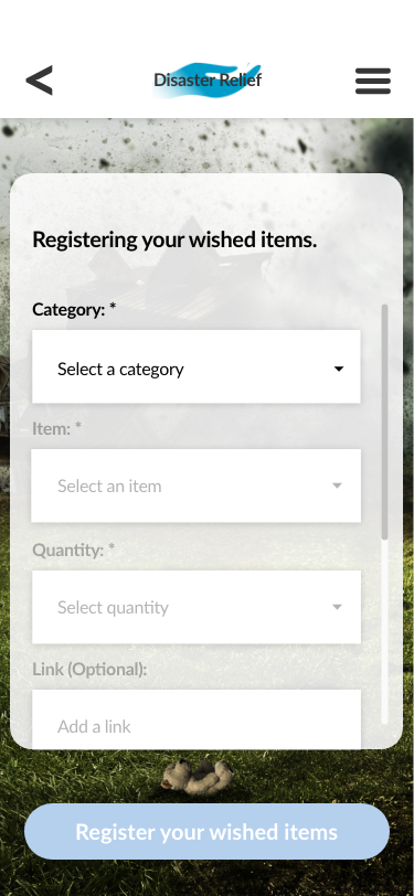
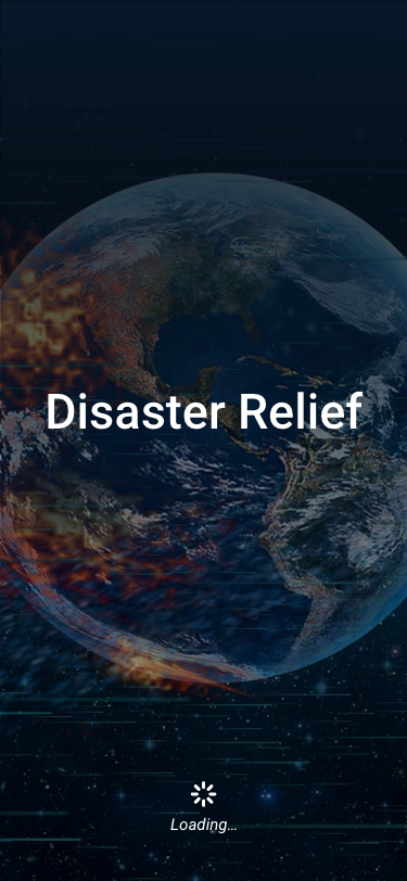
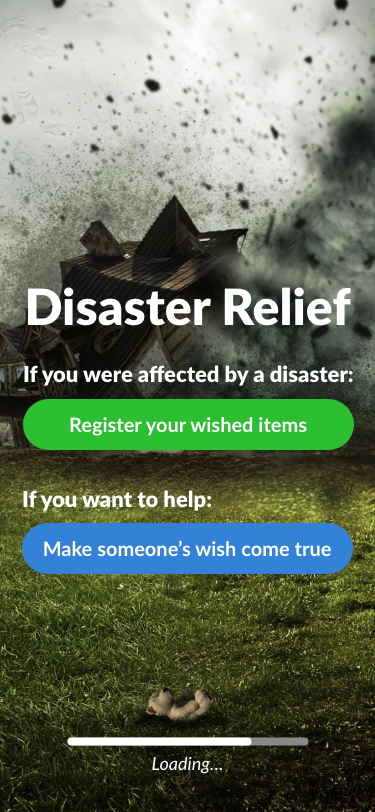
Disaster Relief mobile app prototype, the 2019 American Advertising Silver Student Award winner, provides opportunities for people affected by a natural disaster to register things they really need.

Role: UI/UX designer.

Software: Adobe XD, Adobe Photoshop, InVision App.

Design process

Recently, I did a redesign of this mobile app prototype, the image of which you can see above. Before I walk you through my redesign process, I’d like to share the original award-winning piece and the design process of building it.

Planning

The goal for the project was to design, build and user test a digital product that aims to solve, help alleviate or mitigate a specific problem in the world that has to do with equity. 

While brainstorming a lot of ideas, I came up with the one that had to do with natural disasters. At the time I had to do this project, a lot of people were affected by the Camp Fire, the deadliest and most destructive wildfire in California. Thinking of what these people might need inspired me to design and prototype this mobile application.

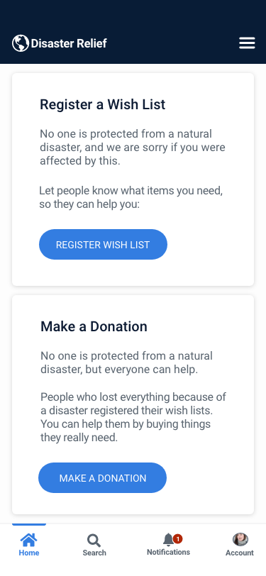
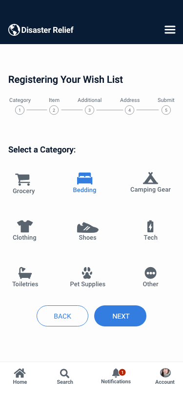
I started this project with a research on basic things people affected by a natural disaster need. Based on the results, I figured out what categories and subcategories had to be included (ex: food and water, clothing and shoes, etc.). 

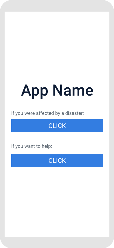
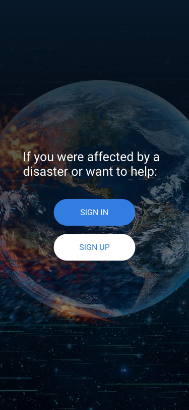
Another step of the research was identifying two types of users – the ones who were affected by a disaster and the ones who wanted to help. To simplify the interface, I split a login page for these two types of users.

Collecting the Content

Next step was finding a picture of any natural disaster that supports the app’s main idea. Here is what I found:

Photo by Comfreak

Then, I did more research on a color scheme (specifically, on psychology behind each color) and came up with the one that matches both – the purpose of the app and the image used.

Designing

When I gathered the content to work with, I started creating mockups. After prototyping the first version in InVision app and user testing, I figured out that inputs for selecting categories were too small. To improve usability, I moved inputs below its labels. To enhance user experience, I also added additional inputs for making registry easier:

Prototyping the App

After improving the mockups, I built the app prototype in the InVision app, which was submitted to the 2019 Addys competition. Click on the video to see the final result:

Redesign 

Looking back at this project, I realized that a lot of things might be improved to enhance user experience. 

I started with the splash screen. Even though the image I selected before explained the idea of the app, it was too busy. To keep the same idea but make it distraction-free, I choose another image by ParallelVision. For better readability, I added a darker background overlay and created a splash screen:

As for the color scheme, I decided to stick with one primary color – blue, which calls to mind feelings of calmness or serenity.

Another important element that was missing was a login screen that was added with redesigning:

In order to make a split page for two types of users more functional, I decided to keep two primary call-to-action on one screen. But I shorten the buttons for better readability and added more description for each call to action block:

To simplify the registration process, I decided to split the process into steps, so it’s easier for users to register things or make a donation. Each dropdown input was brought into an individual step/screen with an indicator of the total number of steps:

For each category and subcategory I also added icons – they are easy to understand and add some personality.

Besides a top navigation menu, I added a bottom navigation bar that provides quick navigation between the top-level views of an app.

And here is the final result

You may also like:

CoffeeLounge

responsive landing page

The Studio Coworking

custom built WordPress theme

Emily Powell's Showroom

responsive landing page